CLIENT PROJECT
C. Charles Jackson Foundation
Bringing Clarity to an Invitation-Only Grant Experience
OVERVIEW
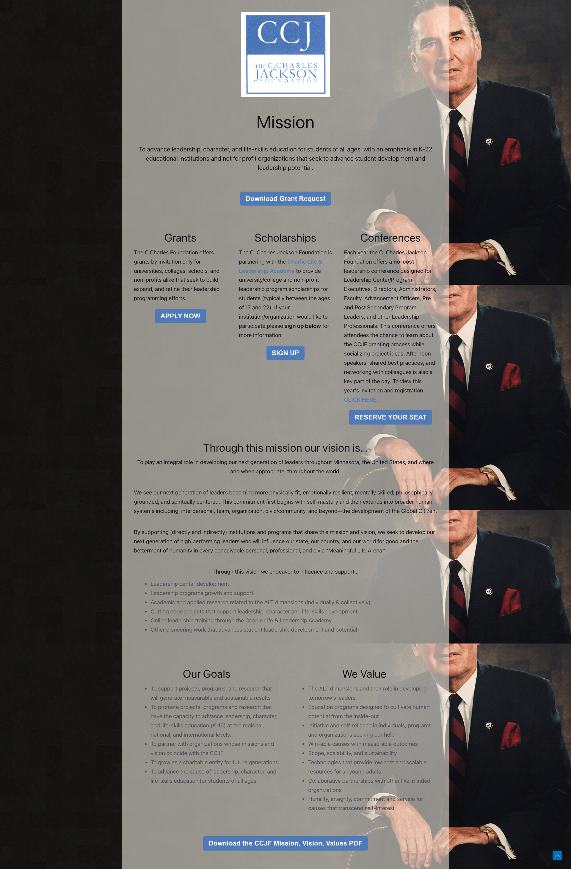
The C. Charles Jackson Foundation is an invitation-only grantmaking organization thats institutional initiatives in leadership and development. Its website serves institutional advancement officers, faculty, and nonprofit leaders seeking funding, however the existing experience lacked clarity, functionality, and direction.
ROLE
UX Researcher, UX/UI Designer, CMS Developer
TIMELINE
On-going Project
SOLUTION
Designing with a guided journey in mind:
To meet the needs of our users, I structured the website to address their questions early and often, allowing users to self-assess fit and eligibility, reducing unqualified inquiries and creating a more efficient process for both users and the foundation team.
PROBLEM
Lack of a clear direction on eligibility and next steps created a barrier for invitee’s to apply for a grant.
The foundations website had:
An outdated website that didn’t reflect its mission or current work
Broken pathways for grant inquiries
Limited visibility into past grants and areas of focus
No structured way to communicate how the invitation process works
Users had:
Uncertainty about eligibility for funding
Confusion about how the invitation-based process works
Difficulty understanding the foundation’s priorities and past work
Lack of clear next steps for initiating contact
AUDIENCE
Institutional advancement professionals, nonprofit leaders, fundraisers, and faculty seeking grant funding

Key Needs
Understand eligibility and fit quickly

Access deadlines and resources in one place
Find information easily through a simple, structured experience

RESEARCH & VALIDATION
Uncovering user needs and barriers for applying
I conducted:
Competitive mobile and desktop audit of similar institutions
Stakeholder interviews
Proxy user research
Current state audit

Information architecture mapping

Current state audit & stakeholder interviews
The project began with stakeholder interviews, where initial assumptions about the target audience and their needs were surfaced. I used these assumptions as a starting point, then evaluated how well the current experience supported them. I mapped assumed user needs against the existing site to identify where expectations aligned or broke down. I assessed the website to understand:
What content was available
Who it currently served
Where the experience supported or failed user needs
This revealed gaps in clarity, structure, and accessibility, making it difficult for users to confidently understand eligibility, navigate the experience, and access key information.
Competitor analysis takeaways
I reviewed similar institutional and foundation websites to understand common patterns, strengths, and gaps. This included a lightweight SWOT style analysis to identify opportunities for improving and differentiating the site. I mapped my assumptions to the information architecture of their sites to see how early these needs were being addressed.
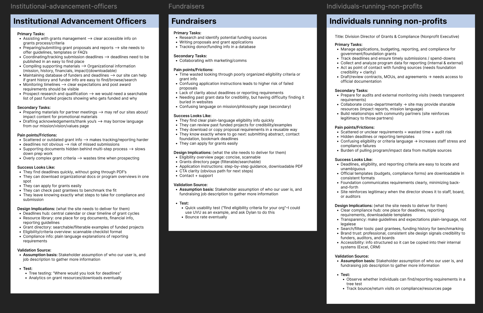
Proxy user research
Due to budget constraints and limited access to target users (institutional advancement officers, nonprofit leaders, and fundraisers), I analyzed job descriptions and role expectations to better understand their responsibilities, workflows, and information needs.
This helped me understand the real world tasks users needed to achieve efficiently and helped inform information architecture as well as design decisions. My analysis revealed those real-world tasks to be:
Managing grant applications and reporting
Tracking deadlines and compliance requirements
Researching funding opportunities
Preparing institutional documentation
DESIGN PROCESS
Information architecture & addressing user needs through content mapping
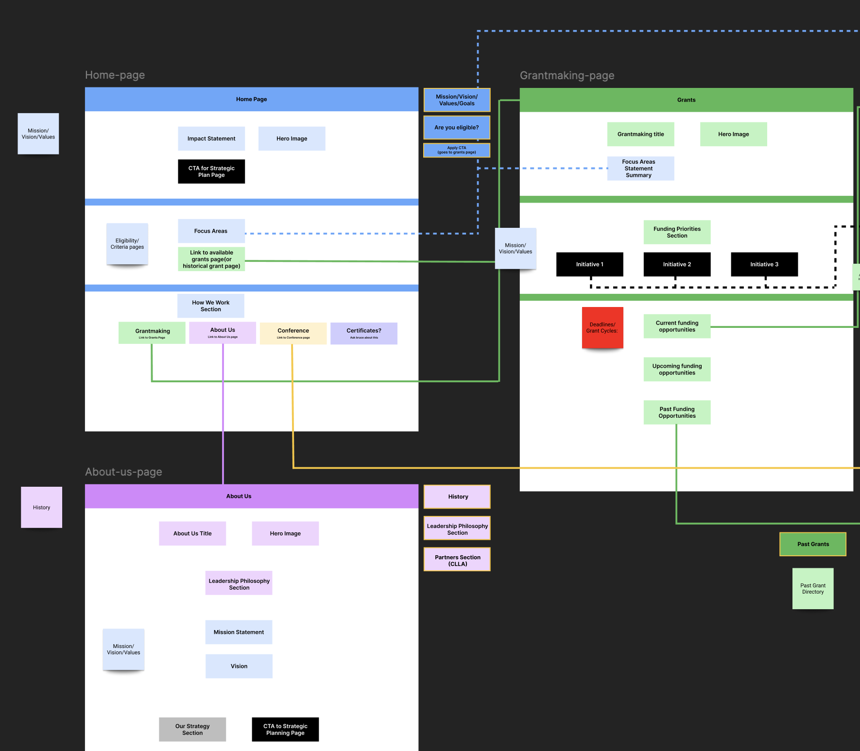
To guide the design, I focused on defining a clear site structure based on the most important user needs uncovered in research, especially around understanding eligibility, finding key resources, and knowing what to do next.
I mapped those needs directly to the site’s pages and sections to make sure each part of the experience was doing something purposeful. This helped ensure users could actually find what they came for, instead of having to guess where information lived.
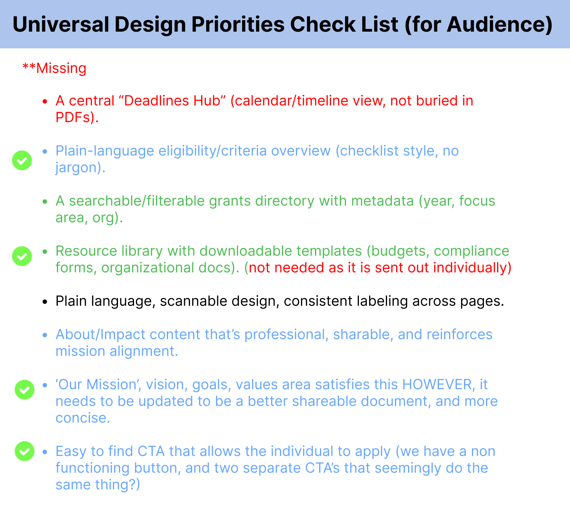
To check my work, I color-coded the sitemap to show where user needs were being addressed versus where gaps still existed. This made it easier to spot areas that needed to be reworked and ensured key pain points like unclear eligibility, hidden deadlines, and hard-to-find resources were being solved in the structure itself.
While formal user journeys weren’t part of the scope, I still approached the structure with a guided flow in mind, helping users move from understanding to action without unnecessary friction.
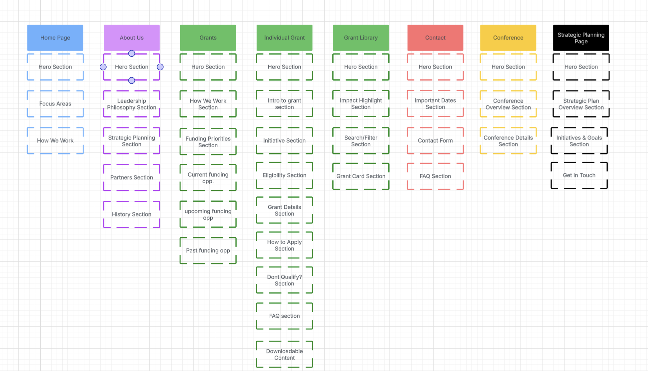
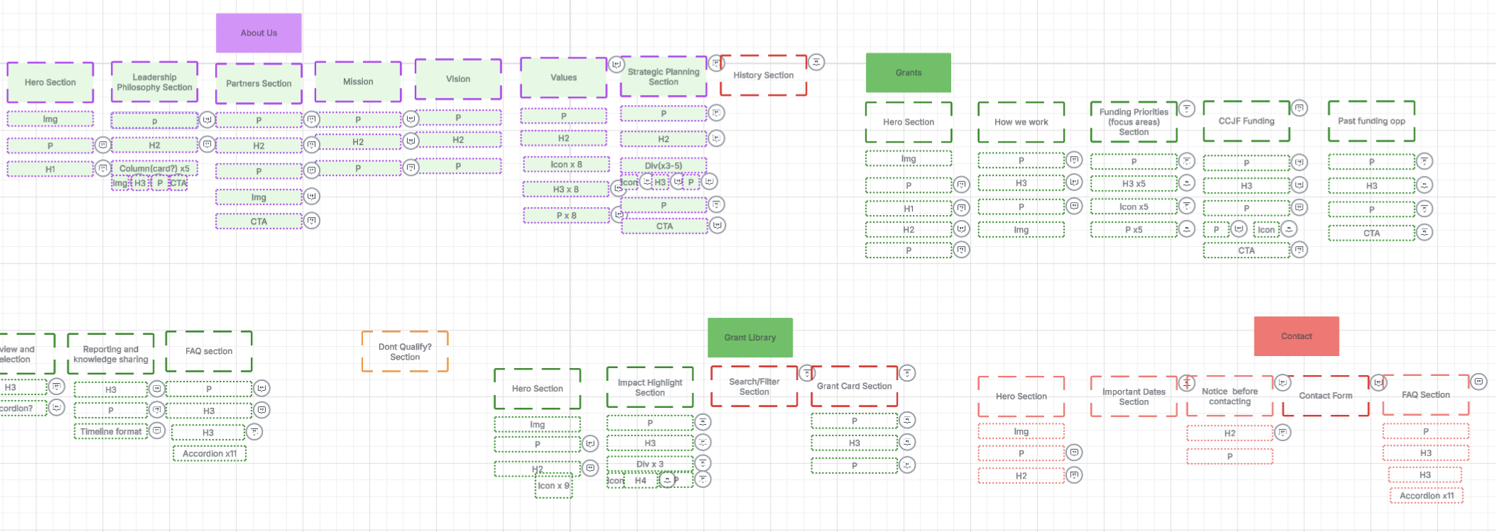
After figuring out which pages were needed, I sketched out simple “skeleton” versions of each one. From there, I took the user needs and pain points I’d identified and placed them directly onto each section using digital sticky notes.
This helped me see where needs were being addressed and where there were still gaps. It also made sure that every section on the page had a purpose.
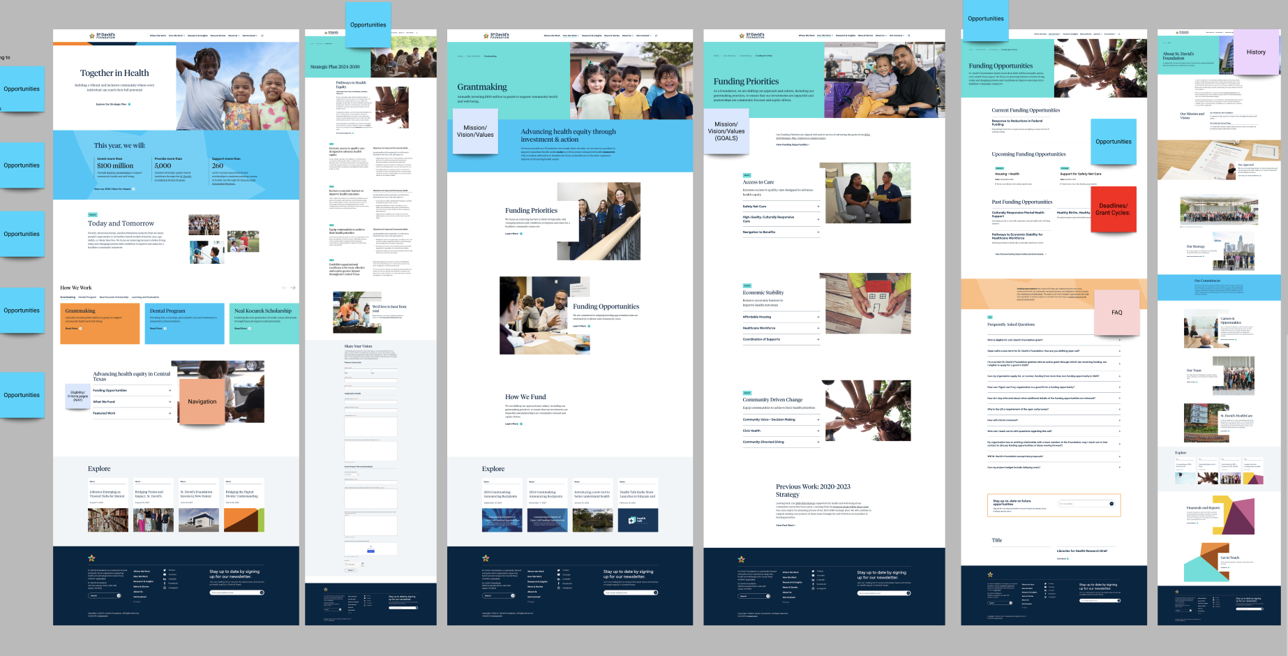
Sketches, wireframes & surface compositions
Once the structure was defined, I moved into sketching and wireframing to start shaping how each page would function. I began with low-fidelity layouts to focus on hierarchy, content placement, and how users would move through the experience, making sure important information like eligibility, deadlines, and next steps were easy to find and understand.
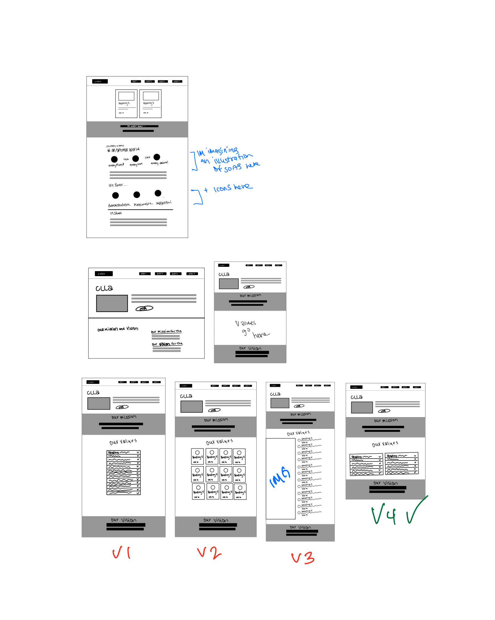
From there, I refined those wireframes into surface compositions. Using AI I was able to generate multiple variations of different designs that could be used to solve our users needs, allowing for more time to spot test and evaluate if they were solving our users problem effectively. The goal wasn’t just to make the site look modern, but to make complex information feel more approachable, scannable, and trustworthy for an institutional audience.
The final site is a lot clearer and easier to move through. It helps users quickly understand what the foundation does, who it’s for, and how to take the next step without having to guess or dig around. Overall, it feels more straightforward, more credible, and better aligned with how the foundation actually works.
OUTCOME
What is being delivered & its expected impact
Delivered
5-page responsive website
Reworked information architecture and navigation
Clear eligibility and “how to engage” pathways
Contact and inquiry flow improvements
Impact
PROJECTED
Reduced confusion around eligibility and next steps
More qualified inquiries from aligned institutions
Faster access to key information (deadlines, resources, past grants)
REFLECTION
Learning & growth
Mapping user needs directly to the site architecture helped ensure important information wasn’t buried and reduced friction across the experience.
Simplifying and reorganizing content made the site feel more credible and easier to navigate.
When direct user access isn’t available, using job responsibilities as a proxy can still lead to strong, grounded design decisions.
A lot of friction came from how information was organized, not from missing content. Restructuring what already existed made a bigger impact than adding more.
Whether users can quickly determine eligibility and next steps without needing to contact the foundation.
Whether the contact/inquiry flow is attracting more aligned and qualified outreach.