CLIENT PROJECT
Glow With Cass
Turning Social Proof Into Conversion for a Local Service Business
OVERVIEW
Glow With Cass is a full-time spray tanning business transitioning from social-media-based bookings to a structured online presence. This project focused on designing and developing a responsive website that builds credibility, reduces booking anxiety, and guides clients confidently from discovery to appointment. By combining user research, competitor analysis, and thoughtful information architecture, the final design supports both first-time event clients and returning customers, while positioning the brand as inclusive, professional, and results-driven.
ROLE
UX Researcher, UX/UI Designer, CMS Developer
TIMELINE
10-12 weeks (part-time, ~10 hrs / week
SOLUTION
Designing with reassurance:
To meet the needs of our users, I structured the experience around reducing uncertainty and guiding clients step-by-step from discovery to booking, answering their questions before they needed to ask them.
PROBLEM
Without addressing user concerns directly, conversion risk was high
Cass had:
No website
No centralized booking flow
No structured way to communicate prep/aftercare
Users had:
Anxiety about looking orange or streaky
Anxiety about what to expect during their appointment
Booking friction concerns
AUDIENCE
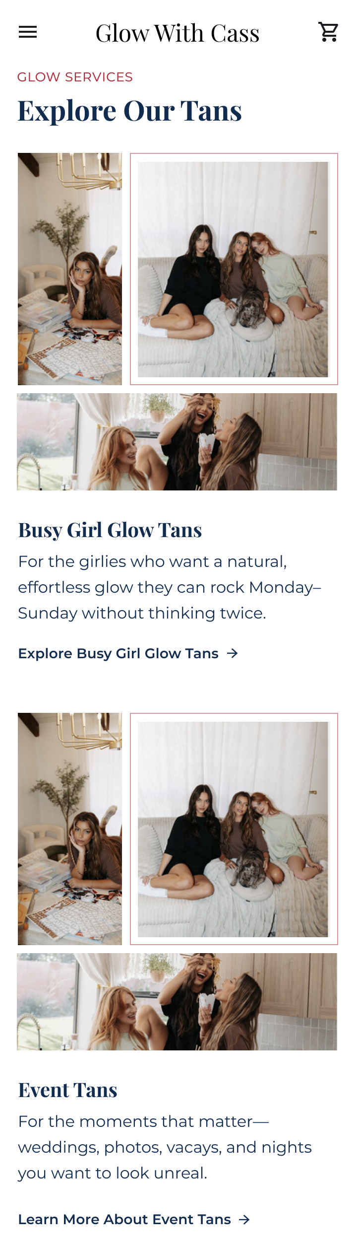
Event Tan Clients

Key Needs
Users want to see real before-and-after photos in natural lighting

Users need clear prep and aftercare instructions

Users prefer simple, mobile-first booking without calling


Returning Clients
Key Needs
Users want fast access to booking

Users expect transparent pricing with no surprises

Users want reliable results

RESEARCH & VALIDATION
Understanding the real pain points
I conducted:
Competitive mobile and desktop audit
Industry best-practice review

In-depth user interviews
Assumption mapping

Instagram poll and survey with clients current audience

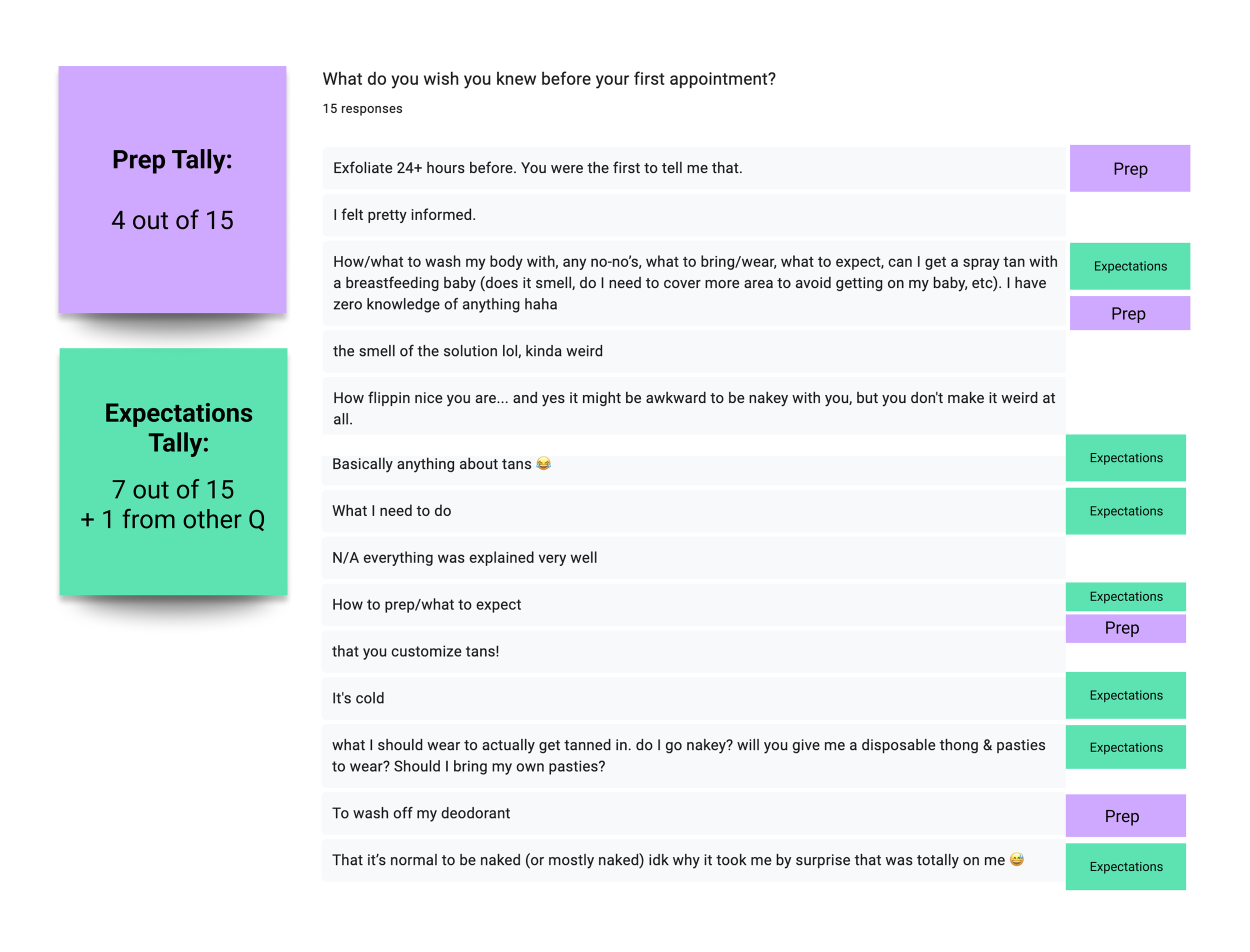
User interview insights
Through interviews and survey responses, I learned that fear of looking orange was the most common anxiety. Clients also expressed confusion around prep and aftercare, and strongly preferred booking through a website calendar rather than calling or DMing.
Several participants said they would pay more for quality results, as long as they felt confident in the artist.
Competitor analysis takeaways & assumptions
Competitor websites that performed well included:
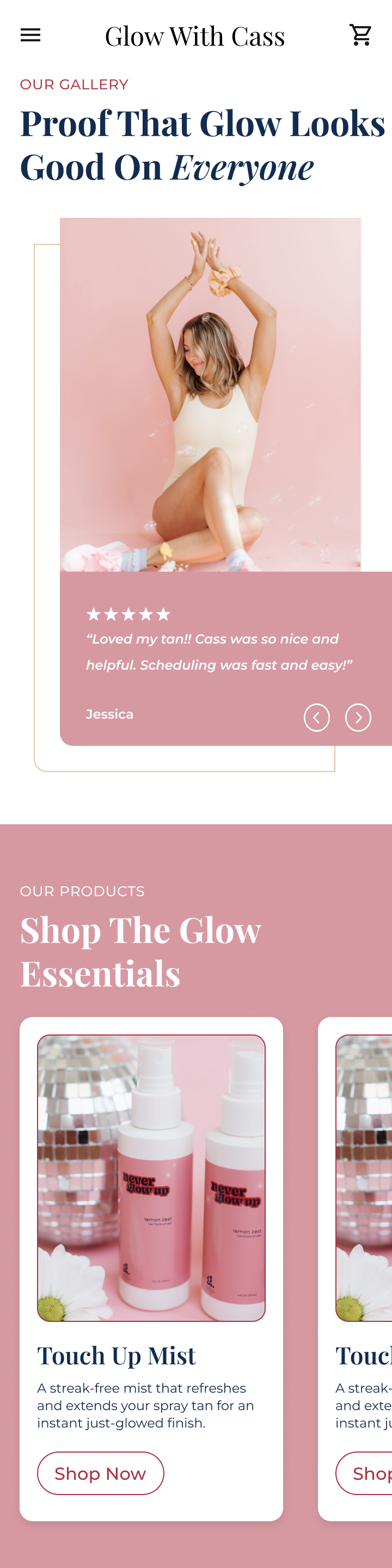
Strong before-and-after galleries
Transparent pricing
Trust-building elements above the fold
Clear explanations of airbrush vs. booth tanning
Validation & key findings through user interviews & survey
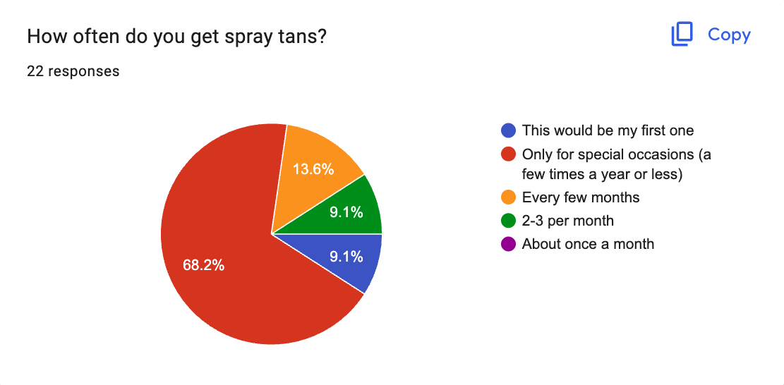
FINDING
68.2% of audience were wanting an event tan
EVIDENCE
Survey notes & interviews
UX IMPLICATION
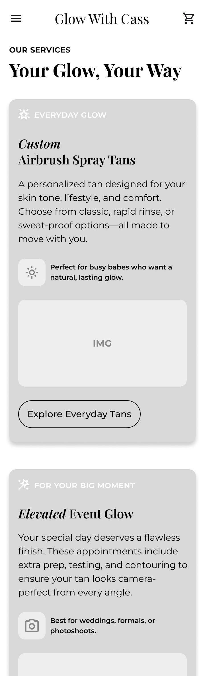
Dedicate a page to event tans
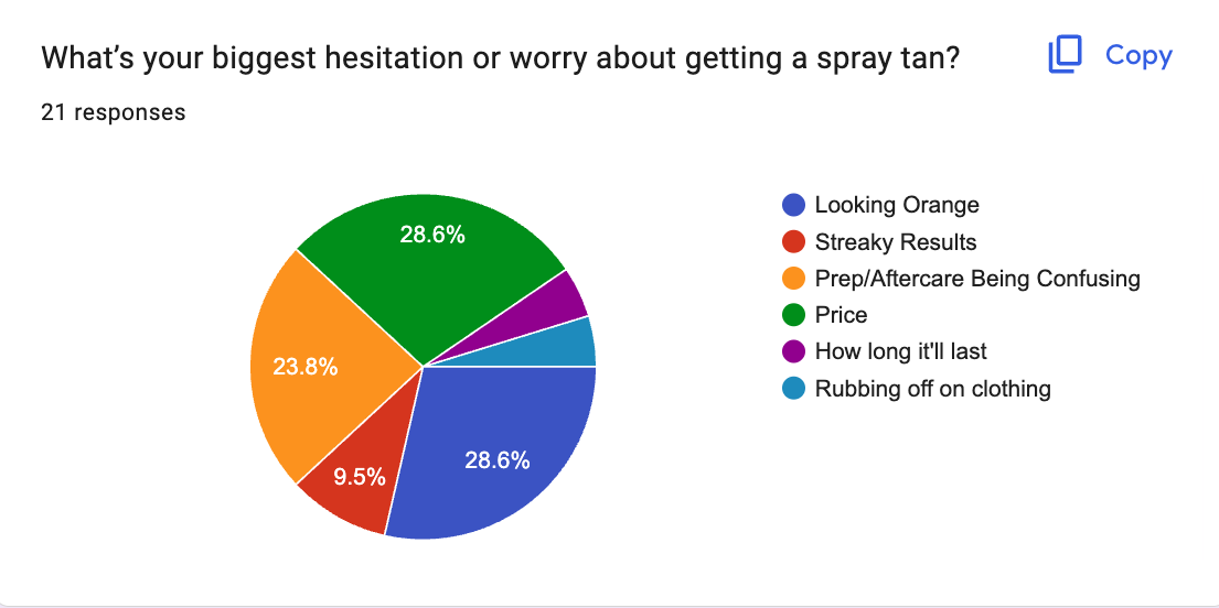
FINDING
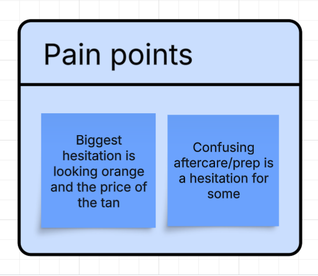
Fear of looking orange & price concerns are the top anxieties
EVIDENCE
Survey votes & interviews
UX IMPLICATION
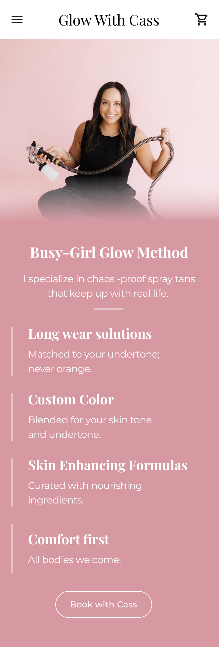
Lead with real, natural-light before/after photos, offer transparent pricing upfront
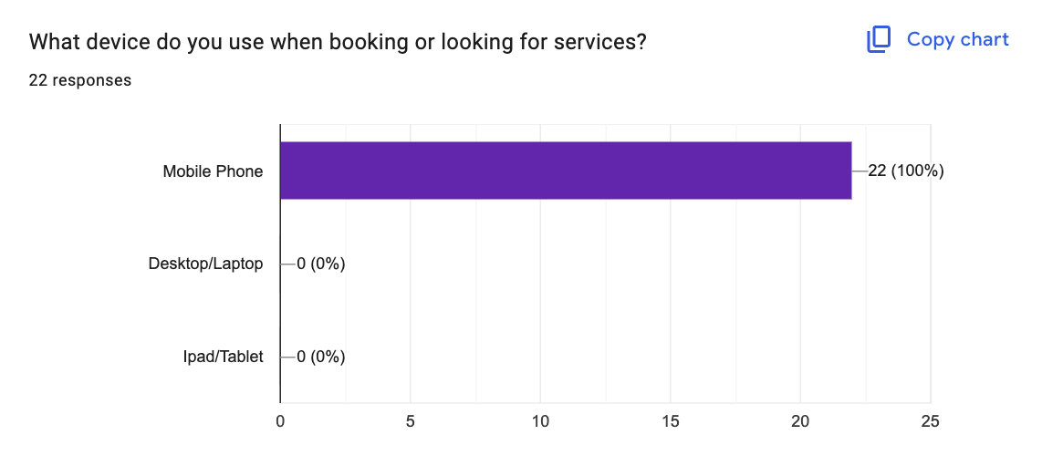
FINDING
Users prefer a mobile browsing experience
EVIDENCE
Survey notes & interviews
UX IMPLICATION
Lead with mobile design, offer calendar-based scheduler
FINDING
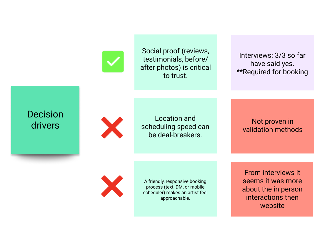
Reviews, photos & credibility statements build trust, and are a requirement to book
EVIDENCE
Interviews emphasized photos, certifications, FAQs
UX IMPLICATION
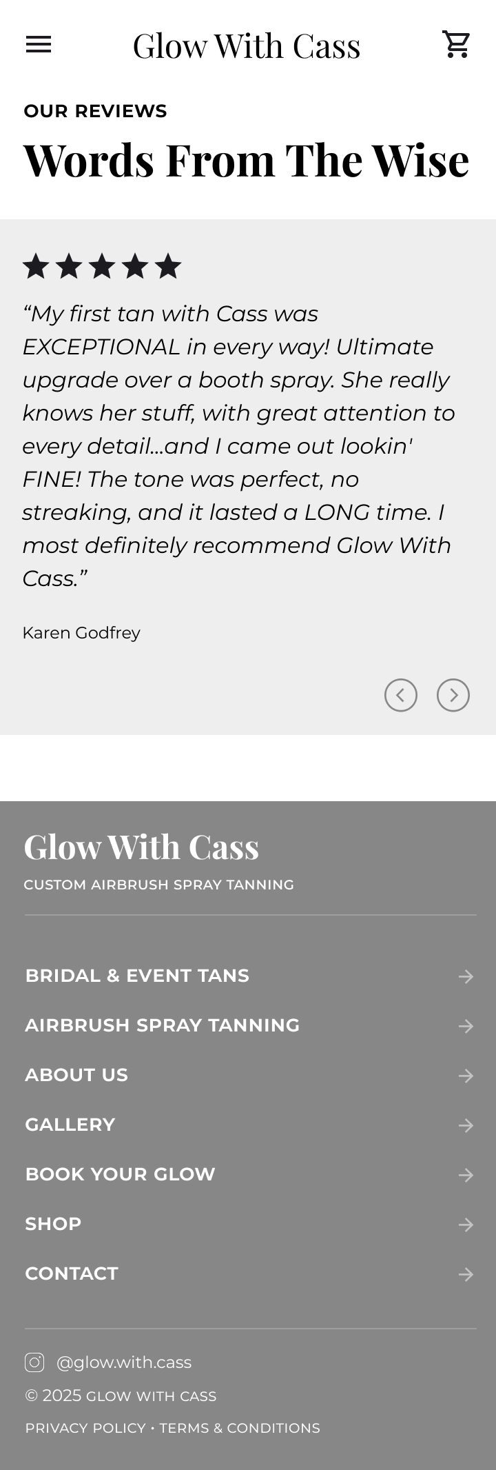
Add variations of trust sections with proof & explanations on every page
FINDING
Prep, expectations & aftercare cause the most stress
EVIDENCE
Survey votes & interviews
UX IMPLICATION
Create clear, step-by-step prep guidance, timeline instructions and FAQ sections
DESIGN PROCESS
Information architecture & user journeys
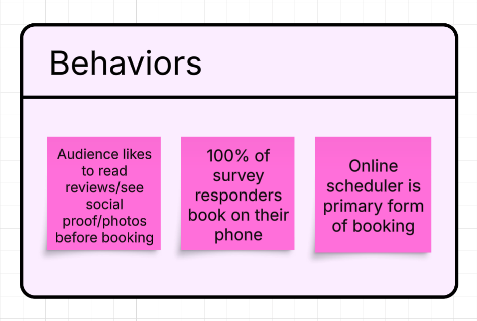
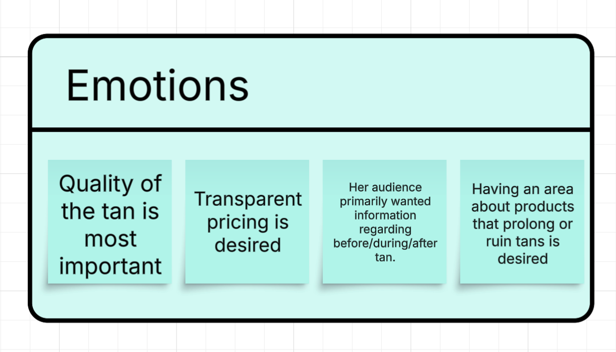
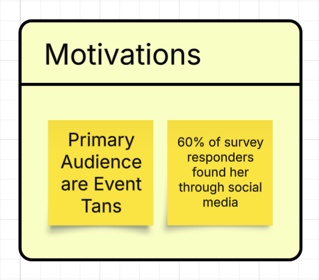
To guide the design process, I mapped user behaviors, emotions, motivations, and pain points before finalizing the information architecture and user journey. Research showed that most clients discover Cass through Instagram, browse on mobile, and look for social proof before booking. Their biggest hesitations were fear of looking orange, unclear pricing, and confusion around prep and aftercare.
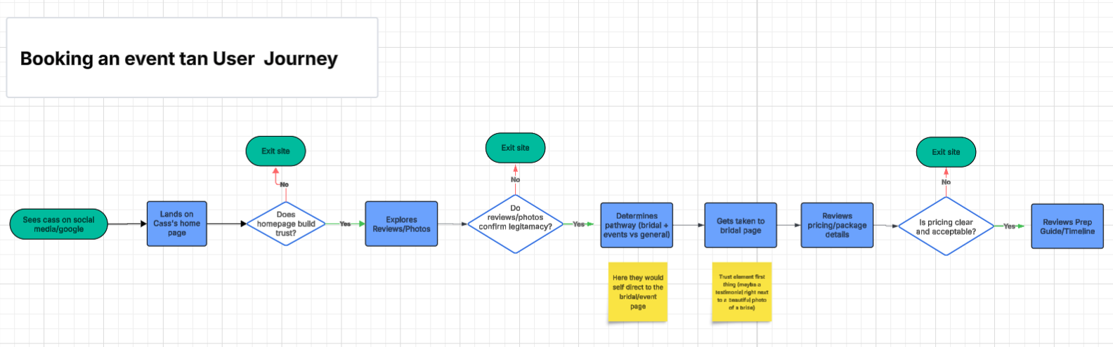
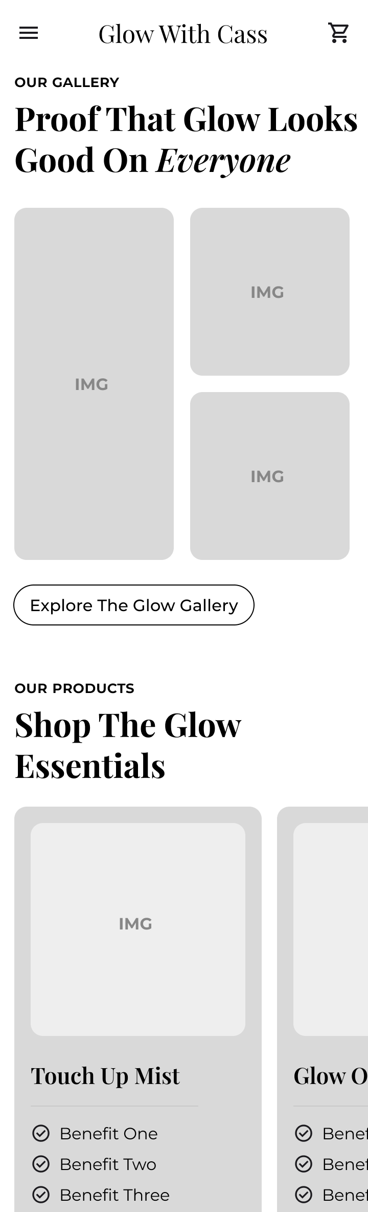
With event-based clients as the primary audience, I structured the site to build trust immediately through testimonials and natural-light before-and-after photos, make pricing transparent, and provide clear step-by-step guidance before asking users to book. The user journey was designed around a realistic decision flow, discovery, proof, pricing clarity, prep expectations, then booking, reducing exit points by addressing concerns at each stage.
Sketches, wireframes & surface compositions
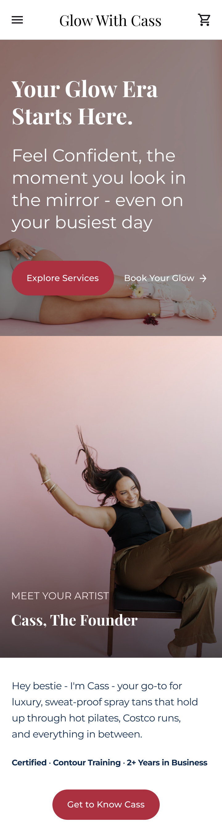
After defining the information architecture and mapping the user journey, I translated those insights into low-fidelity sketches to explore layout hierarchy and content placement. The initial homepage sketches prioritized immediate trust signals, including testimonials, natural lighting imagery, and clear booking access above the fold .
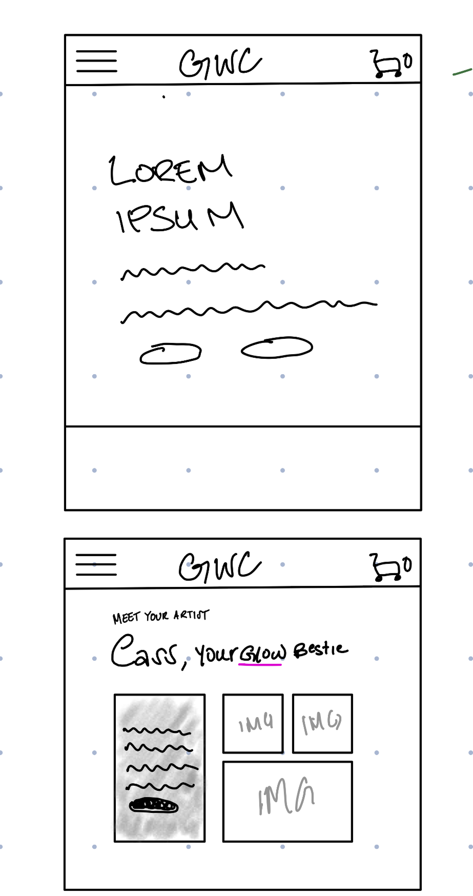
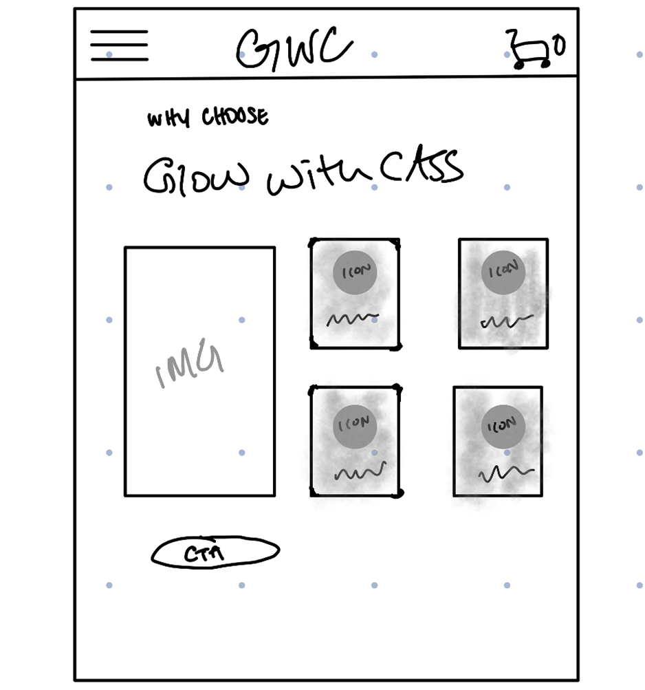
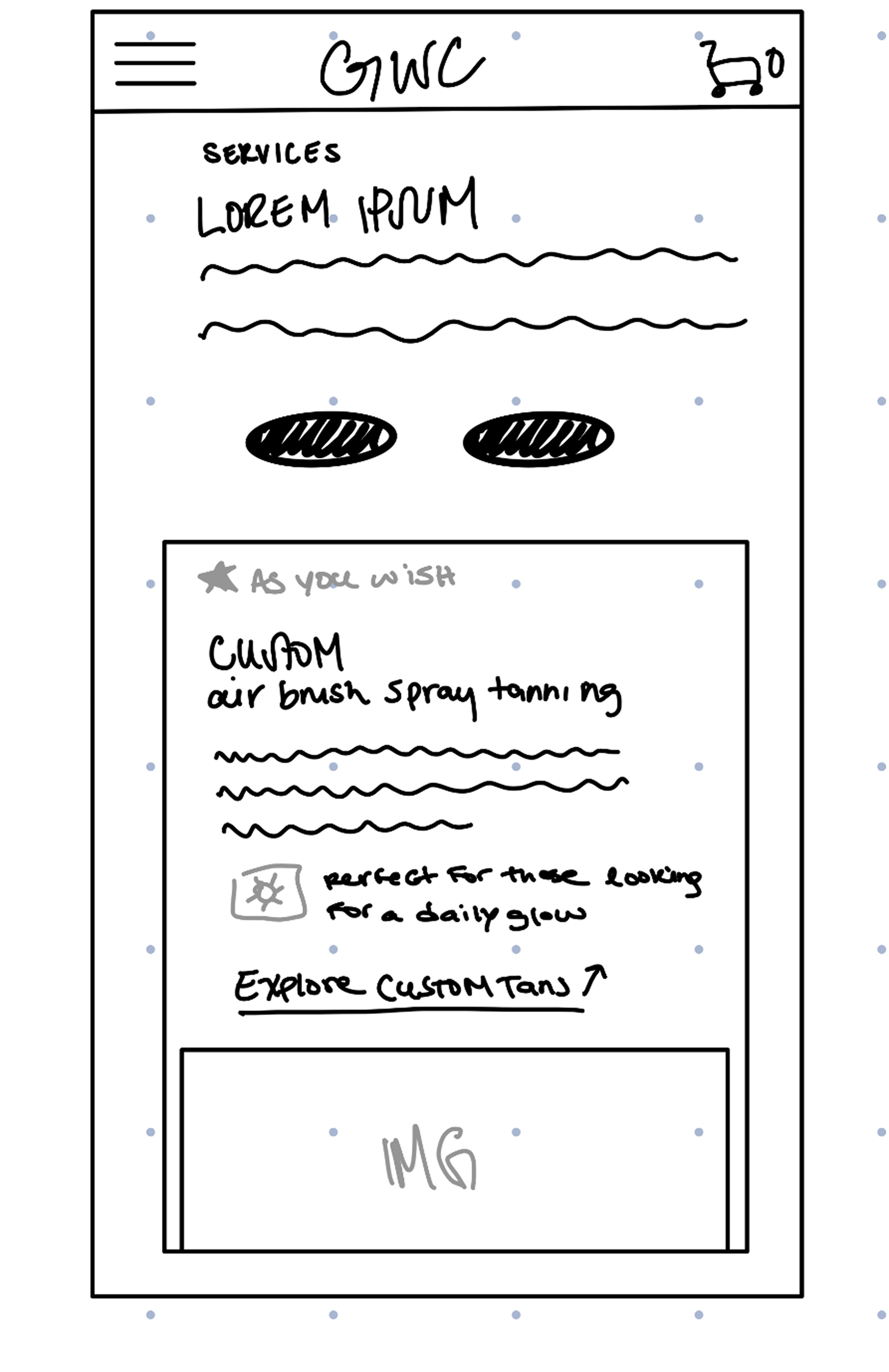
From there, I developed structured wireframes to test section order, pricing clarity, and how users would navigate between services, gallery, and booking without friction.
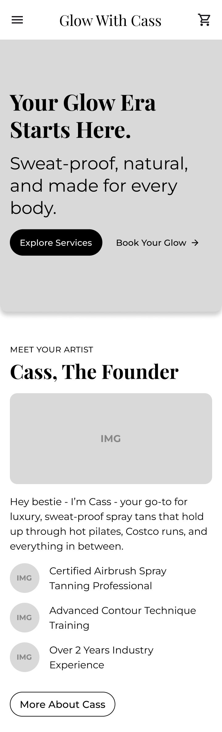
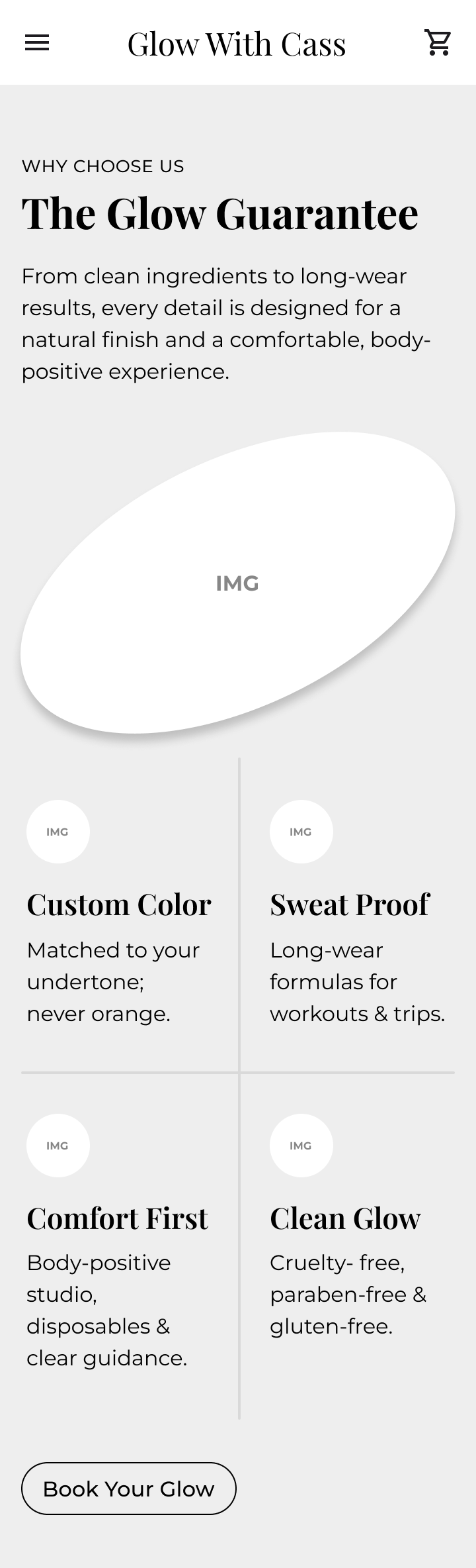
Surface compositions focused on maintaining visual warmth while keeping layouts clean and mobile-first. Each iteration refined CTA placement, simplified navigation, and ensured that reassurance elements were positioned before asking users to commit to booking.
OUTCOME
What is being delivered & its expected impact
Delivered
7-page responsive website
Integrated booking platform
5 product e-commerce setup
SEO-ready structure
Google Maps integration
CMS training for client independence
Impact
PROJECTED
Reduced booking friction
Users informed of prep instructions
Trust forward positioning
Scalable structure for SEO growth
REFLECTION
Learning & growth
Leading with social proof and before-and-after imagery significantly strengthened perceived credibility early in the user journey.
Structuring the site around real anxieties (prep clarity, pricing transparency, fear of looking orange) reduced friction and aligned the design with user decision-making patterns.
In service-based businesses, emotional reassurance is often more important than feature depth or visual complexity.
Designing from validated user concerns rather than assumptions, leads to clearer priorities and stronger outcomes.
Test the placement of prep and aftercare content, before booking vs. post-booking to measure impact on conversion.
Experiment with different CTA variations (“Book Now” vs. “Check Availability”) to evaluate which language reduces hesitation.